FOR IMMEDIATE RELEASE
May 28, 2019
BERKELEY, CA: The San Francisco Bay Area is more segregated today than it was nearly 50 years ago, according to research published Tuesday by the Haas Institute for a Fair and Inclusive Society at UC Berkeley which developed an interactive map to calculate segregation based on various measurements across the region’s nine counties.
The new interactive segregation map, which is being unveiled in tandem with the release of Part 3 of the Institute’s “Racial Segregation in the Bay Area” research series, allows users to switch between six different measures of segregation to examine and compare how segregation patterns have changed over the past five decades. The most recent data is from 2010.
The report, which includes more than 10 illustrative charts and other graphics, describes prominent measures that assess the degree of racial residential segregation, and compares these measures to offer a more holistic understanding of segregation in the Bay Area. The report and interactive mapping tool examine single-race measures, binary measures, and multi-group measures.
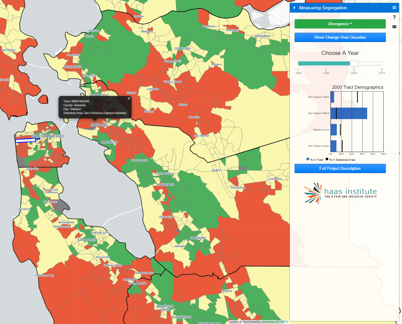
For example, users can select to view the map using a binary measure of the exposure of Black-white, Hispanic-white, Asian-white, or Black-Hispanic populations down to the neighborhood level anywhere in the Bay Area, and move between each measure to see the differences. The map also allows users to see how many members of a particular racial group would have to move to create an integrated community using the “dissimilarity” index.
The map also includes an “isolation” measure for various racial groups that shows their concentration in a particular area relative to other groups, and two holistic measures: “divergence” and “entropy.”
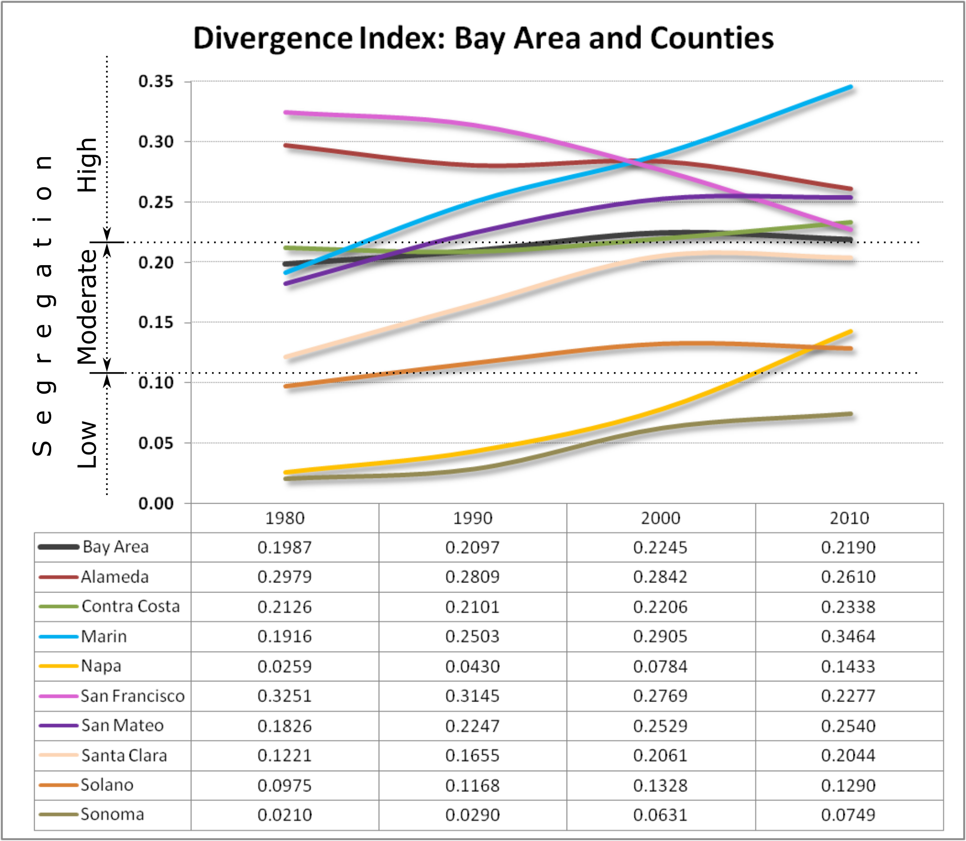
The divergence measure looks at the difference between the racial demographics in a specific geography compared to the demographics of the larger region. For example, a census tract whose demographic makeup is similar to the demographics of the county where that tract is located would indicate little divergence, and vice versa.
Most powerfully, by moving the slider from decade to decade, the map provides a visual illustration of the changes in each of the segregation measures over time. This allows users to identify tracts that have segregated or become more integrated between any two decades over the last 40 or 50 years, depending on the index.
Using these different measures, the Haas Institute’s latest segregation report, which draws from US Census data, finds that of the Bay Area’s nine counties, seven of them saw increases in racial segregation from 1980 to 2010. The most dramatic increases in this segregation occurred in Napa, Sonoma, and Marin counties.
While some measures of segregation—notably the Dissimilarity Index—present a more integrated portrait of the Bay Area, other measures such as the Divergence Index do not. In fact, the San Francisco Bay Area remains segregated despite reduction in the segregation of particular racial groups.
The interactive map can be accessed here, and the accompanying web report is available here.
Part 1 of the segregation series presented a series of detailed maps illustrating segregation across the region within each of the nine Bay Area counties and in its major metropolitan areas, while Part 2 of the series disaggregated and untangled patterns of segregation into specific patterns of racial demographics.
As lead author and Haas Institute Assistant Director Stephen Menendian explained, “We believe that this mapping tool is the most sophisticated segregation map ever created in the United States or abroad. There are a few wonderful interactive segregation maps created by researchers we cite in this series, but none that have such a wide range of functionality and also allow users to also see changes over time. This is an immensely powerful tool to understand a critically important phenomenon.”
Future reports in this series will examine the harms of segregation and will summarize social science literature on the harmful effects of segregation, and will feature original research on the relationship between segregation and life outcomes.
Media Contact:
Marc Abizeid
marcabizeid@berkeley.edu
###